

At PubMatic, we are working hard to improve the ease-of-use for our products and innovate to improve the client experience. It is our goal to provide technology that empowers our publishers to do what they do best. We are excited to announce a change that came as a direct result of your helpful insights.
The next time you log into PubMatic’s publisher-facing user interface (UI) you’ll be greeted by an updated main navigation. This important release culminates many months of gathering your direct feedback, user experience design iteration, usability testing, engineering implementation and quality assurance testing.
Through your feedback, you encouraged us to simplify the UI and reorganize content into more logical groupings. Here’s a little more information about how we’ve done that.
New Look and Feel
The first thing you’ll notice about the new design is its friendly and open feeling. We’ve applied new typography and incorporated more whitespace to give your eyes a place to rest and absorb your navigation options.
The first-level navigation takes up considerably less screen real estate, which provides more space to display content without the need to scroll. Second-level navigation now appears full-width and is organized into columns. This approach eliminates crowding on sub-menus and provides ample room to display our growing feature set.
Updated Navigation
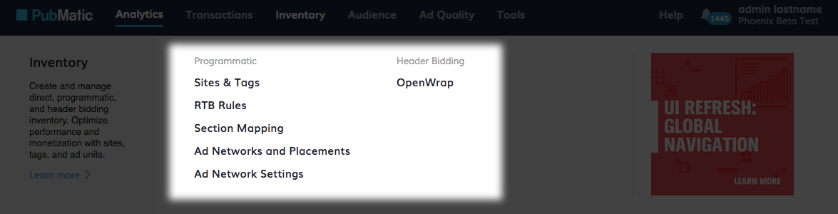
We took this opportunity to reorganize the navigation into logical groups which we are confident will make locating items more intuitive for the user. For example, in the past we placed utility features in one of two areas in the main navigation bar – Admin or Config. However, it wasn’t clear which utilities fell into which category.
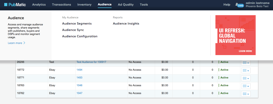
Now we’ve grouped them together under one clearly labeled menu called Tools. Likewise, we’ve placed all dashboard and reporting features under Analytics. Moves like this simplify our top-level navigation and create room to expose growing functional areas, like Audience.
Easier-to-Find Updates
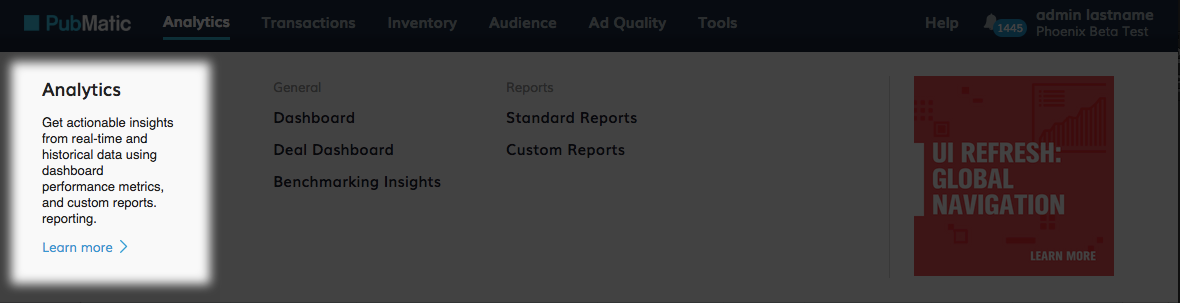
As we bring more publishers onto our system, we realize not every new user is aware of all the features we offer or the purpose of each one. Our new navigation incorporates area descriptions, which guide the new user to discover what can be accomplished in different areas of the UI. Each area description also provides a link to a dedicated PubMatic community page where the user can learn more.
Stay “In the Know”
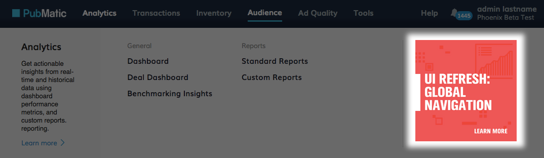
Finally, you told us you wanted more frequent updates about the features we release and the solutions they provide. As a result, we’ve rolled out in-application feature notifications to keep you better informed.
Feature notifications deliver brief summaries that complement our product release notes, which are also found on the Community Site. They appear in the navigation area near relevant topics and provide handy drill downs to even more detail. Additionally, we will be using feature notifications to offer usage tips and tricks and to solicit your valuable feedback so that we can continue to innovate our platform.
What’s Next?
We are excited to have you use this new navigation and hope you feel, as we do, that it is an important step toward improving the overall usability of our applications. Of course, we don’t wish to stop there. In the coming months, our UX team is working on designs that will simplify key product workflows and enhance the ease of use of our data tables. Stay tuned for future updates and let your account manager know if you have any questions or concerns.